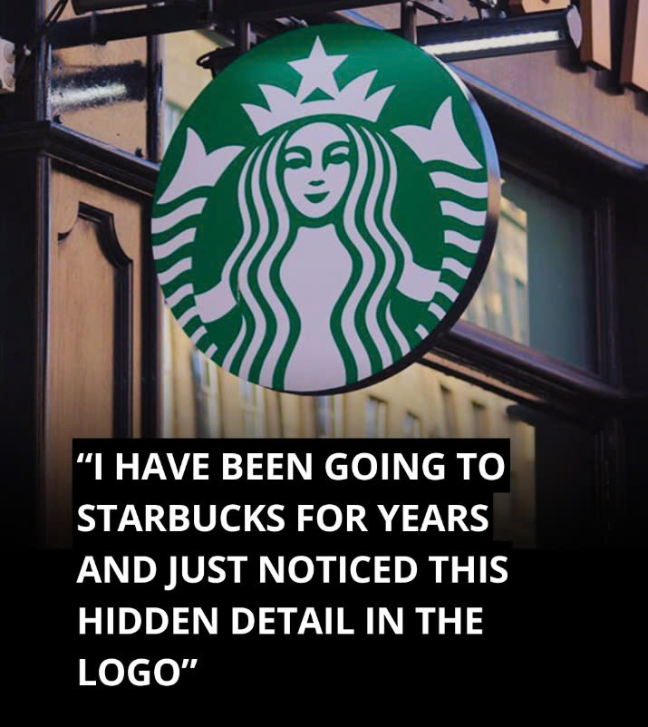
The Starbucks logo is one of the world’s most recognizable symbols, welcoming millions of coffee enthusiasts daily. However, did you know that this famous logo conceals a subtle secret that many people overlook? At first glance, the Siren’s face appears perfectly symmetrical, but a closer inspection reveals an intriguing imperfection. Let’s explore this hidden feature and what makes the Starbucks logo so distinct.

The Evolution of the Starbucks Logo
Since its creation in 1971, the Starbucks logo has gone through several transformations. The original design featured a brown double-tailed mermaid, known as the Siren, drawing inspiration from nautical themes and Herman Melville’s classic novel, Moby-Dick. This initial logo was meant to capture the sense of adventure and mystery associated with the sea and coffee itself.
In 1987, Starbucks adopted the green color that we know today, symbolizing growth, freshness, and prosperity. As the company continued to expand, the logo underwent further changes, with a notable update in 1992 when Starbucks went public. This version refined the Siren’s features, making the design cleaner and more modern. However, the most significant redesign occurred in 2011, when the words “Starbucks Coffee” were removed, leaving the Siren’s face as the central focus of the logo. This bold change allowed the emblem to represent not just coffee, but a broader range of products as the company diversified.
The Siren’s Symbolism
The Siren in the Starbucks logo is not just an aesthetic choice; it symbolizes the irresistible appeal of coffee, much like the mythological Sirens who lured sailors to their fate. The Siren’s presence in the logo aims to evoke the same magnetic pull, drawing customers to Starbucks stores worldwide. However, as Starbucks sought to expand beyond its coffee roots, it was clear that the Siren needed to evolve as well, reflecting the company’s broader ambitions and appeal.
The Intentional Imperfection
In 2011, when Starbucks partnered with the global branding firm Lippincott to redesign the logo, the goal was to make the Siren exude confidence, allure, and approachability. The initial version of the redesigned logo featured a perfectly symmetrical face, but something felt off. According to creative director Connie Birdsall, “She was uncannily beautiful, a bit creepy, to be honest.” The flawless symmetry gave the Siren an unnatural, robotic appearance that didn’t align with Starbucks’ brand values.
The design team realized that to make the Siren more relatable, they needed to introduce a small flaw. “The imperfection was important to making her really successful as a mark,” Birdsall explained. By incorporating a slight asymmetry, they made the Siren feel more human and approachable.
The Subtle Asymmetry
If you examine the Siren’s face closely, you’ll notice that it isn’t perfectly symmetrical. Specifically, the right side of her face is slightly different from the left—there’s more shading, and her nose dips a bit lower on that side. This tiny imperfection adds a touch of humanity to the Siren’s face, making the logo more inviting and less cold.
As design partner Bogdan Geana pointed out, “It felt a bit more human and felt less like a perfectly cut mask” after the asymmetry was added. This seemingly minor change transformed the Siren from a flawless figure into a relatable symbol for millions of coffee lovers worldwide.
Why Asymmetry Works
The decision to make the Siren’s face asymmetrical goes against the traditional idea that beauty lies in perfect symmetry. However, the Starbucks design team recognized that too much perfection could make the logo appear cold and distant. By introducing a slight imperfection, they created a logo that felt more approachable and friendly, fostering a deeper connection with customers. This design choice was crucial in ensuring that the Siren remained a welcoming symbol rather than an intimidating one.
The Siren’s Broader Role
The removal of the words “Starbucks Coffee” in the 2011 redesign was a significant step in allowing the Siren to represent more than just coffee. By that point, the Siren had become so recognizable that it no longer needed accompanying text to identify the brand. This shift enabled Starbucks to venture into new product categories, from breakfast items to evening snacks and even beverages like wine.
The Thoughtful Subtlety Behind the Logo
The next time you hold a cup of Starbucks coffee, take a closer look at the Siren’s face. Her subtle asymmetry serves as a reminder that imperfection can be more relatable, human, and welcoming. This hidden detail in the Starbucks logo isn’t just a clever design trick—it’s a reflection of thoughtful branding.
The asymmetry is a testament to the idea that a small flaw can make a big difference, transforming the Siren from a symbol of mere corporate identity into a more approachable figure that resonates with customers worldwide. The Starbucks logo continues to be a prime example of how even the smallest details can impact a brand’s image, making it feel more genuine and inviting.


